
MEUBLL, our first custom theme – Part 3
The last part of this series of articles on designing a custom front-end user experience for Front-Commerce. Today, we will see how to enhance the user experience through design, once the first user testing session is over.
The key features expected by the users have been identified, the wireframes are up to date, now it’s time to bring them to life.
Defining a graphic universe for MEUBLL
The first step, and probably the most important, is to define a relevant, accessible and engaging graphic charter. Colors, typography, grids, content spacing and iconography are all elements to be taken into account. Put together, these elements give life to the theme and make the user experience more pleasant.
Where to start? There is no perfect method, but making a moodboard is an effective starting point to generate ideas, lots of ideas. At least it was in our case.
Here are some ideas that we found particularly interesting:
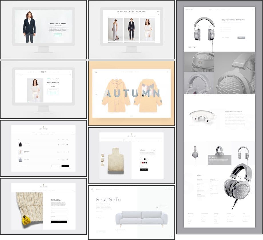
As you can see, the team quickly moved towards something very minimalist, inspired by the designs found in Scandinavian countries. The objective was to propose a simple and uncluttered design, which would not take precedence over the functional aspect. The design’s function would be to dress up the boutique, without distorting it.
Thanks to this mood-board, a global vision of the desired aspect for our theme was quickly drawn, and the graphic charter naturally followed.
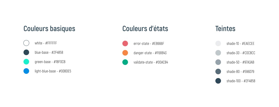
Graphic chart – Colors
Here is the final color palette validated by the team. Pastel colors, white, black and some shades of gray: simple and effective.
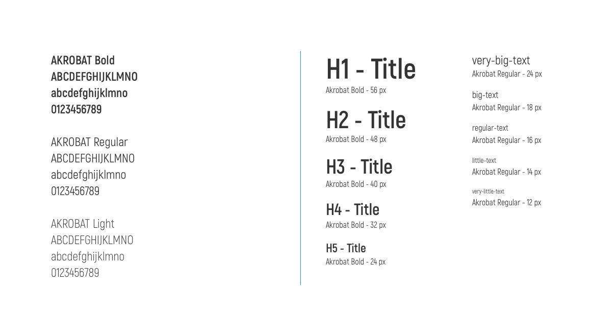
Graphic chart – Typography
Choosing a font is always delicate. Serif, sans-serif, Google fonts or not, bold, italic, loading time on the site, size, weight, bold … you get the idea.
And yet, choosing the right typeface is essential to ensure optimal readability for your users, in all conditions and on all media (mobiles, tablets, computers, watches …). Your choice must therefore be well thought out.
For MEUBLL, our typographic choice was oriented towards a sans-serif typeface, more pleasant to read and more adapted to the minimalist style we were aiming for. We selected Akrobat, for its very good legibility and its atypical shapes. It has 8 weights, is free and very light to integrate.
Concerning the text height (or line-height), we have set up the following formula: line-height = text size + 8.
Graphic chart – Grid, spacing and icons
For our design grid we stayed with something very classic with a “base 8”. This grid allows a simplified arrangement of elements, and in particular a simpler management of the icons (which have generally a size of 16x16px – a multiple of 8). Most screens also have a size divisible by 8, which facilitates the design and the responsive.
Learn more about the: “Base 8” Grid
The same goes for the spacing between elements. We made sure to have multiples of 8 most of the time, to keep consistency. This allows us to standardize the interfaces on the whole site, and facilitates the work of designers and integrators.
Finally, concerning the icons, we chose the Nova icon pack, which corresponded perfectly to our expectations.
Download : Nova Free Icon Pack (350+ icons)
Apply this graphic chart to your custom front-end user experience
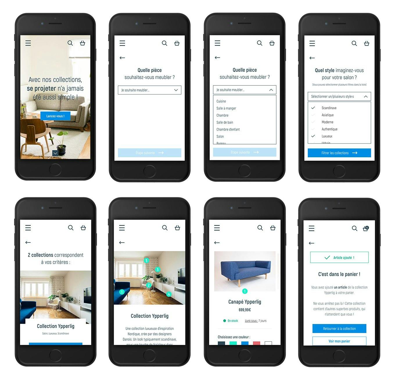
The graphic chart is in place! It’s time to apply it to the wireframes and give life to our dear theme MEUBLL. After applying all the principles explained in the part 2, here is the final rendering of the theme in its mobile version, and more particularly of its key functionality: the product collections.
Why the mobile version? Simply because mobile e-commerce is booming, and it will very soon surpass desktop e-commerce. In addition, thinking of your website in mobile-first allows you to understand the issues around size and content layout from the start. It is indeed easier to add content to a desktop version after the mobile version is developed. Thinking “mobile-first” will also guarantee your users an improved user experience on their favorite device.
Here is a preview of the mockups of this feature:
Our last word on Meubll
Now you know how we design our custom front-end user experiences & themes at Front-Commerce. This methodology, obviously perfectible, allows the whole team to get involved on the project in order to propose coherent, efficient and accessible themes.
Feel free to react to this series of articles, and share your methodologies with us 🙂
It’s a 4 part series!
Part 1: Develop an idea, create value, stay inspired
Part 2: Involve your (future) users
Part 3: Create a tailor-made user experience You’re here!